

This is the new design of my portfolio, launched in 2024, built with a focus on modularity, responsiveness, and clean animations.
CONSTRAINTS
Major constraint was my inexperience with using Framer. This was my first time truly trying to build and create a portfolio site that I can use for many more years to come.
Main Goals
Being my second portfolio site I wanted to improve areas from my old site mainly responsiveness and consistency. I also want to manage it to be more organised by documenting, what needs to be done, what I'm doing, and what I have done. Basically looking more into working with design systems and project management.
RESPONSIVENESS
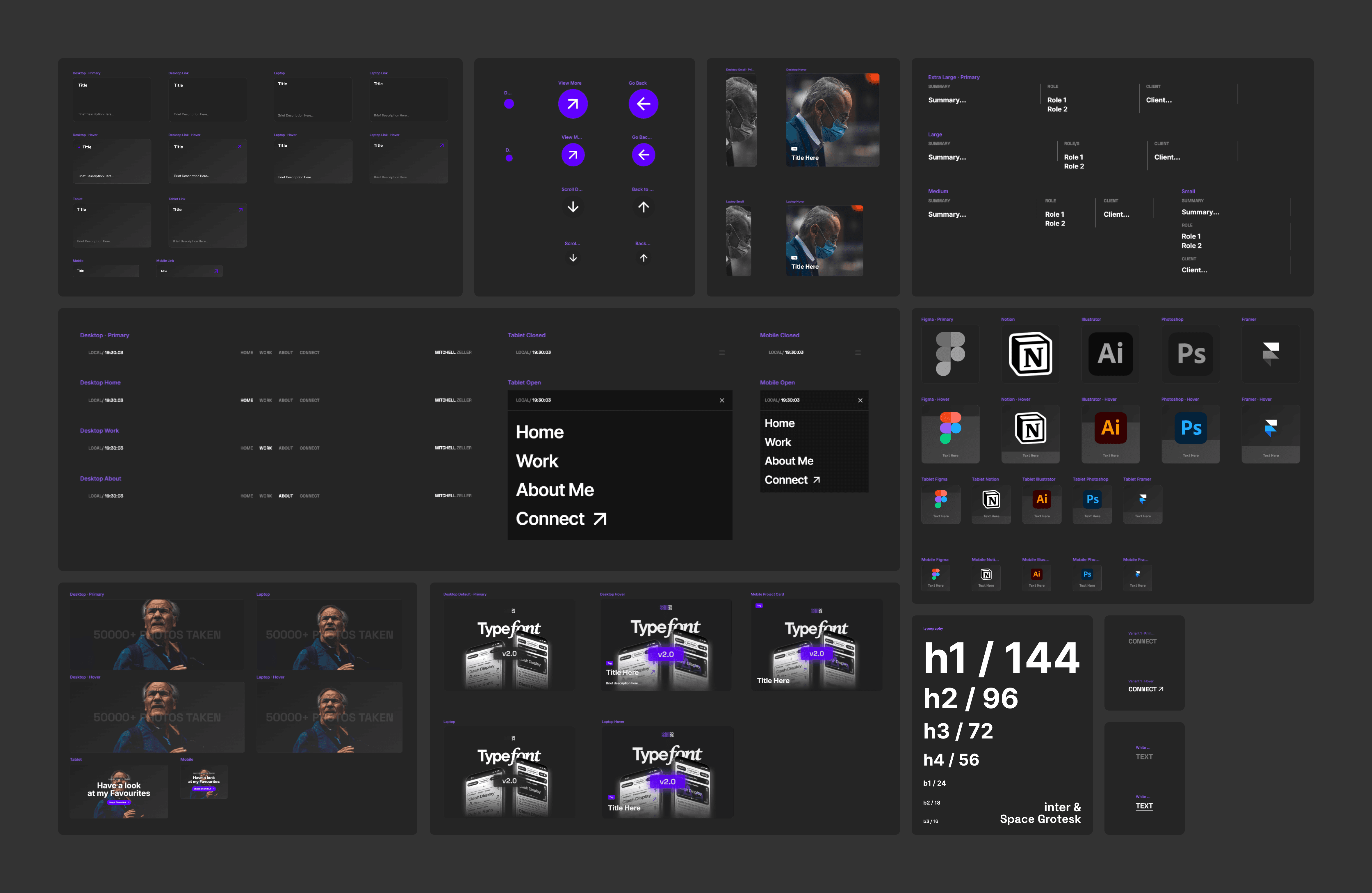
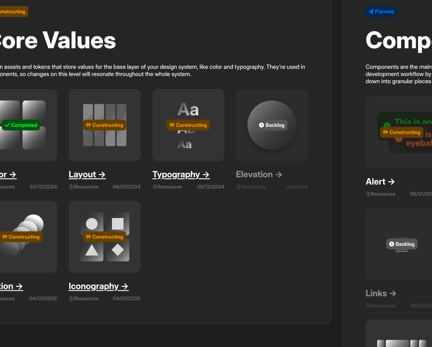
DESIGN SYSTEM
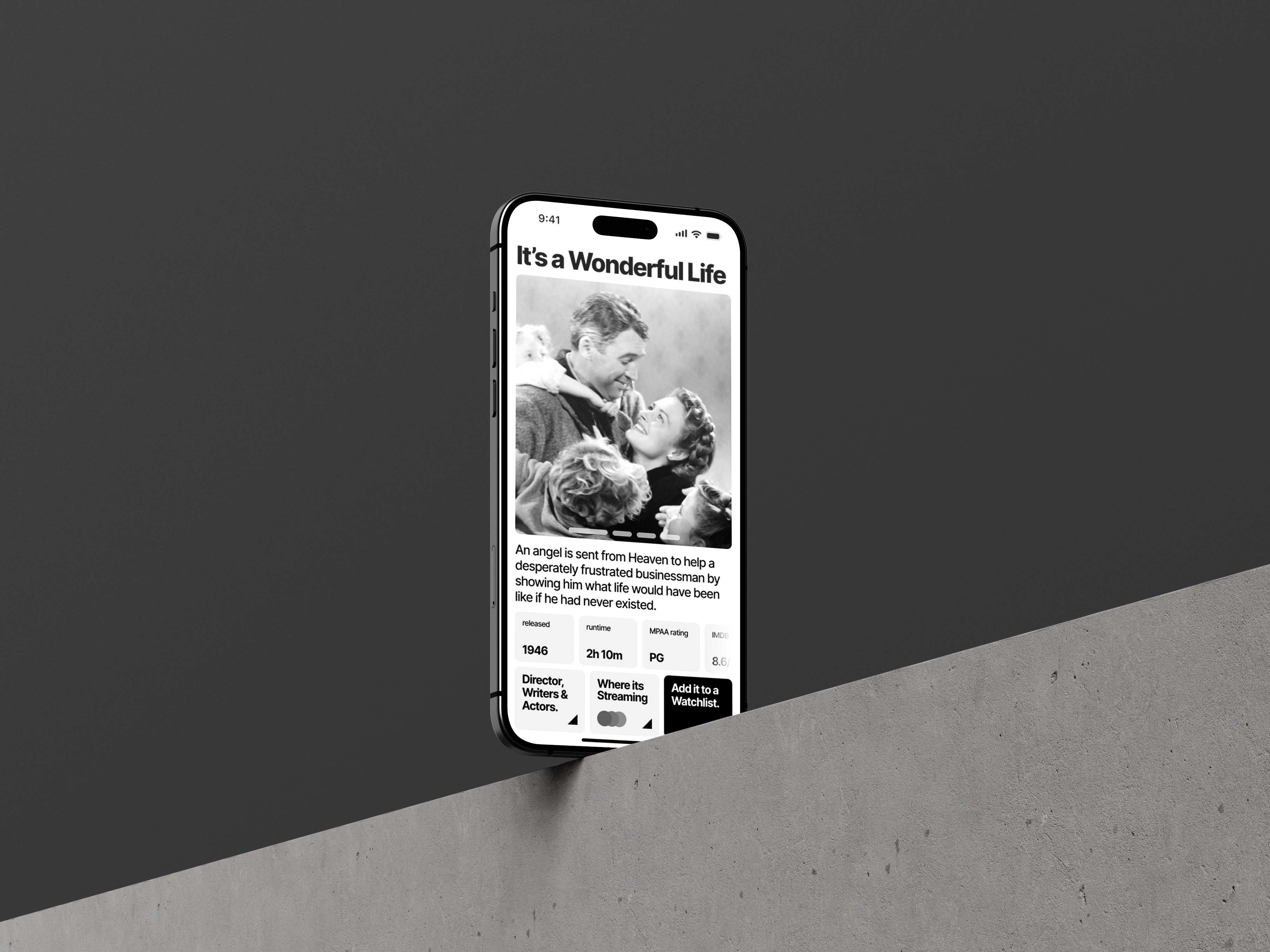
I decided to improve this partially because Framer has a built in sort of assets/styles section that I can set to easily change the source of a value for it to change everything set to it. For example I can easily adjust the title font-size, this not only saves me a whole load of time but you can also set breakpoints for when this text resizes down and so it greatly helps me keep the site consistent, responsive, and user friendly.
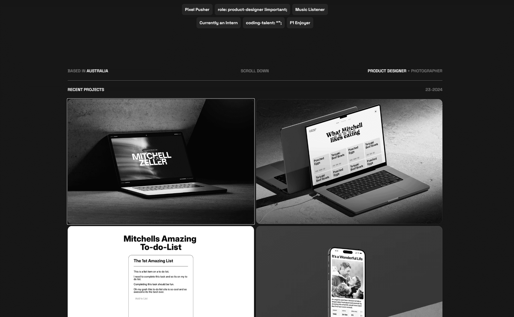
I've also recently went back through my components along with this redesign to reduce the amount of <div> elements I use. I've also introduced new components mainly, tags which can be used across the site to better describe what my projects entail through the tools or topics it covers. Meaning people can easily read the title, tags and see if their interested if not they can go back and look through a different project.
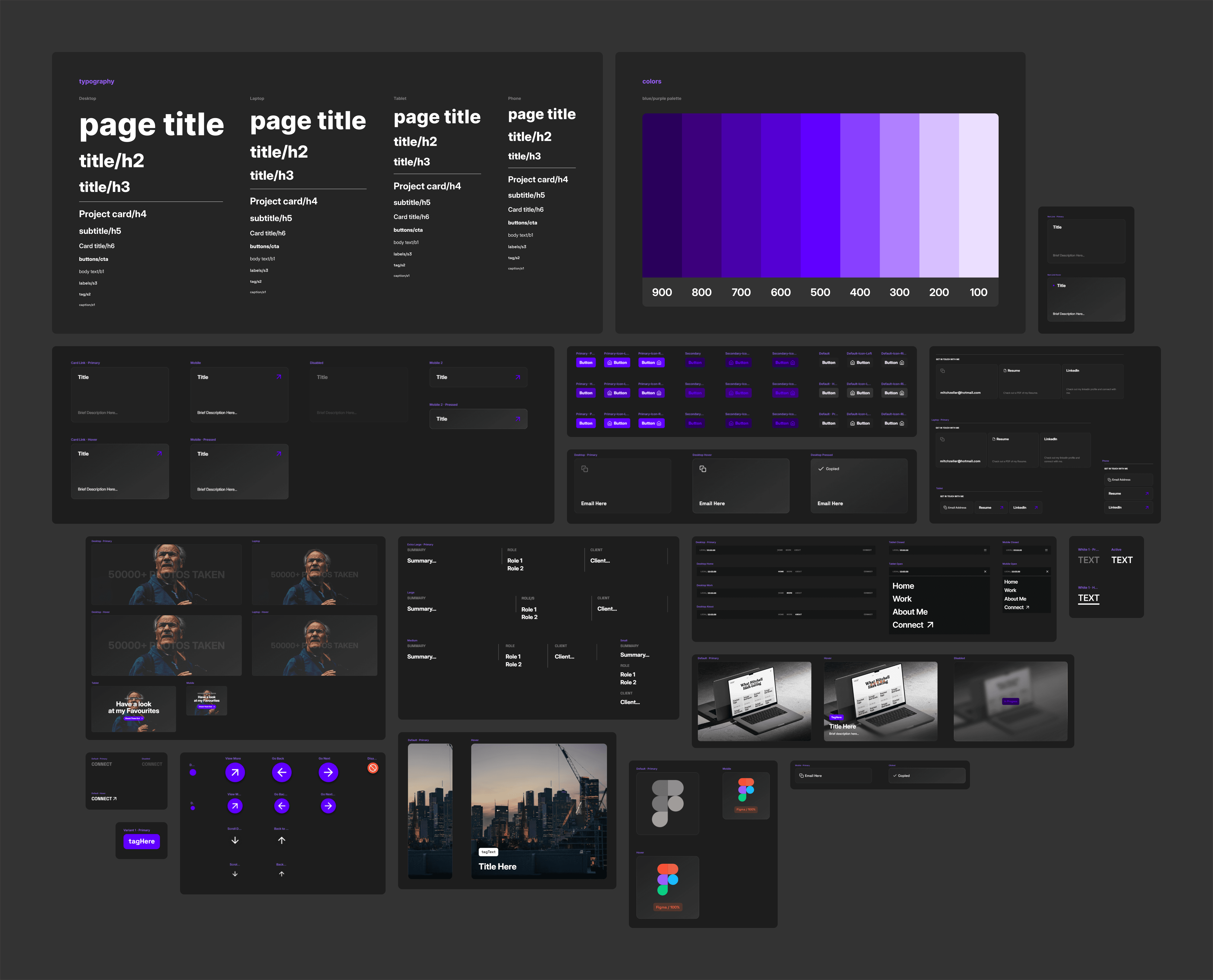
All in all I have spent time to fix a lot of the major components, introduced more coherent and hierarchal text styles and colors, below shows my design system from before to now.
Before
After
Project Management
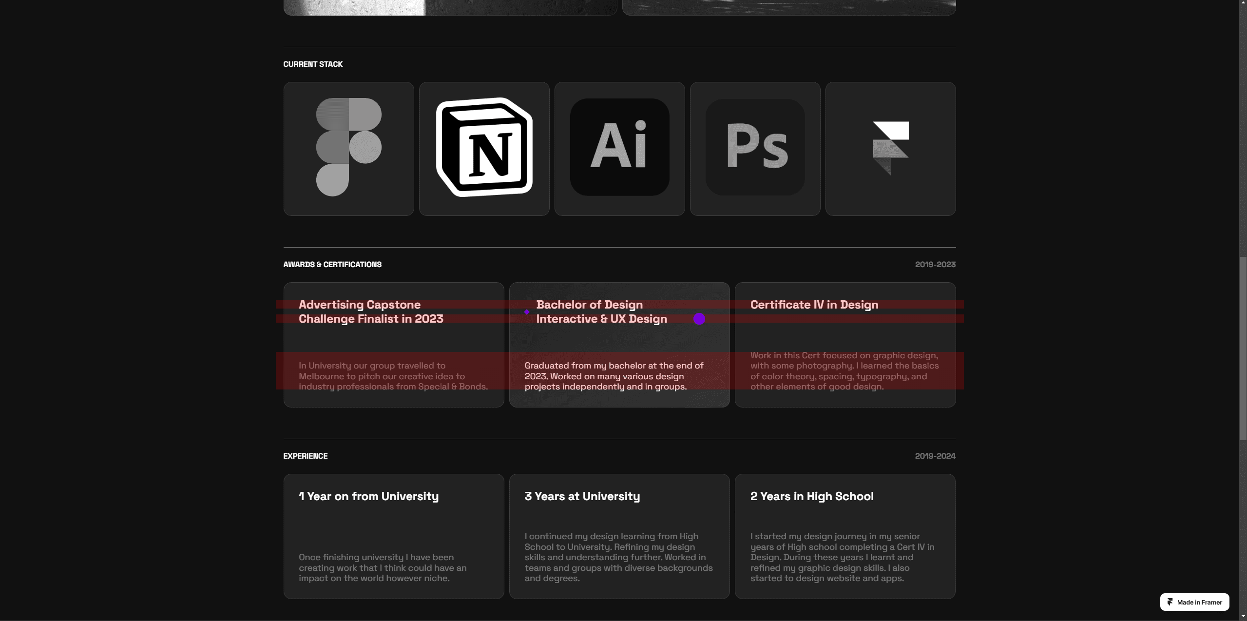
This is quite a new topic for me and I am sort of just doing it wrong or right and basically just what works for me and this project. I am using Notion to help organise my projects, set tasks for specific projects, and using automations to easily set a finished task to complete.
Because this is new to me including Notion this workflow/method of organizing my projects is only being used with my portfolio site for now but any new projects I decide to start will use this. Because my portfolio is never really done and I'll constantly be improving. It seemed to be a perfect place to basically just use and test how I could manage my projects.
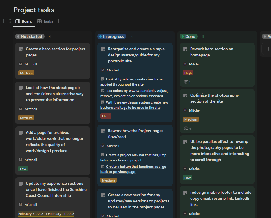
Another cool thing I briefly messed around with which Notion recently introduced are, buttons. They seem to be quite useful and I haven't used them much but below is an example of how they could be used,
And so since I am the only person working on this project this is probably not really necessary but from what I can tell you can set more then one action to a button. Meaning it could also send a notification to another Notion user with a message saying I've finished or check this out for review etc.
Outcome
I think I've improved my portfolio quite a bit since creating my first one. Obviously your portfolio is never 'finished' but I'm at a point where its more of a maintenance of myself and the work I create. Visually it looks good and the process works and I might over time as my knowledge (hopefully) increases smooth out some of the rough edges it has.
My first portfolio I used to apply to countless jobs, internships or graduate programs achieving one interview. With this new portfolio along with a new simplified resume achieved two internships (so far) and ideally more to come (a job job).


ALL RIGHTS RESERVED