
Retro is a film focused app providing a simple, minimalistic and easy way to find and learn more about old films.
This is a project I have worked on since early 2024 and is the first version. It will be an ongoing project I continue to improve and learn from.

CONSTRAINTS
This was my first app design and so my lack of experience and understanding is most likely a constraint. Being an idea there is little user research or data I can build upon to inform design choices. Main focuses for this project was looking at the different ways a user can navigate an app.
DESIGN STYLE
Considering the idea and focus of the app itself on old movies I decided the app could reflect that time period in some way. Currently the idea behind the design style and direction is to be like a old newspaper with the pages being either 2-3 columns and where applicable a single column. That is also the reason behind the black, white and grey palette.
Being the first version of the project this and many things may change in the future if I decide to revisit it with more understanding and experience in the ui/ux design area.

NAVIGATION
I decided to try and create the app around no navigation bar typically found at the bottom of most apps you will use. Now I don't think they are bad because they aren't but I just wanted to test my thinking and create something. By doing this I also had to rethink the user flow as there wasn't an easy 4-5 icons at the bottom that all lead to core pages.
Below shows how I did this, the user starts on what I called the, dashboard, from there they have a page of buttons for them to explore. The app at the moment features three core pages and where the user will spend most of their time. The next core page is where the user discovers the films and then the user can swipe again to see a overview of the film with buttons leading to more information.
Below shows this interaction,
Ideally this would be the main focus of explaining how the app works in the onboarding when a user first opens the app. I have created a early onboarding experience and it can be testing in the prototype at the bottom of the page.
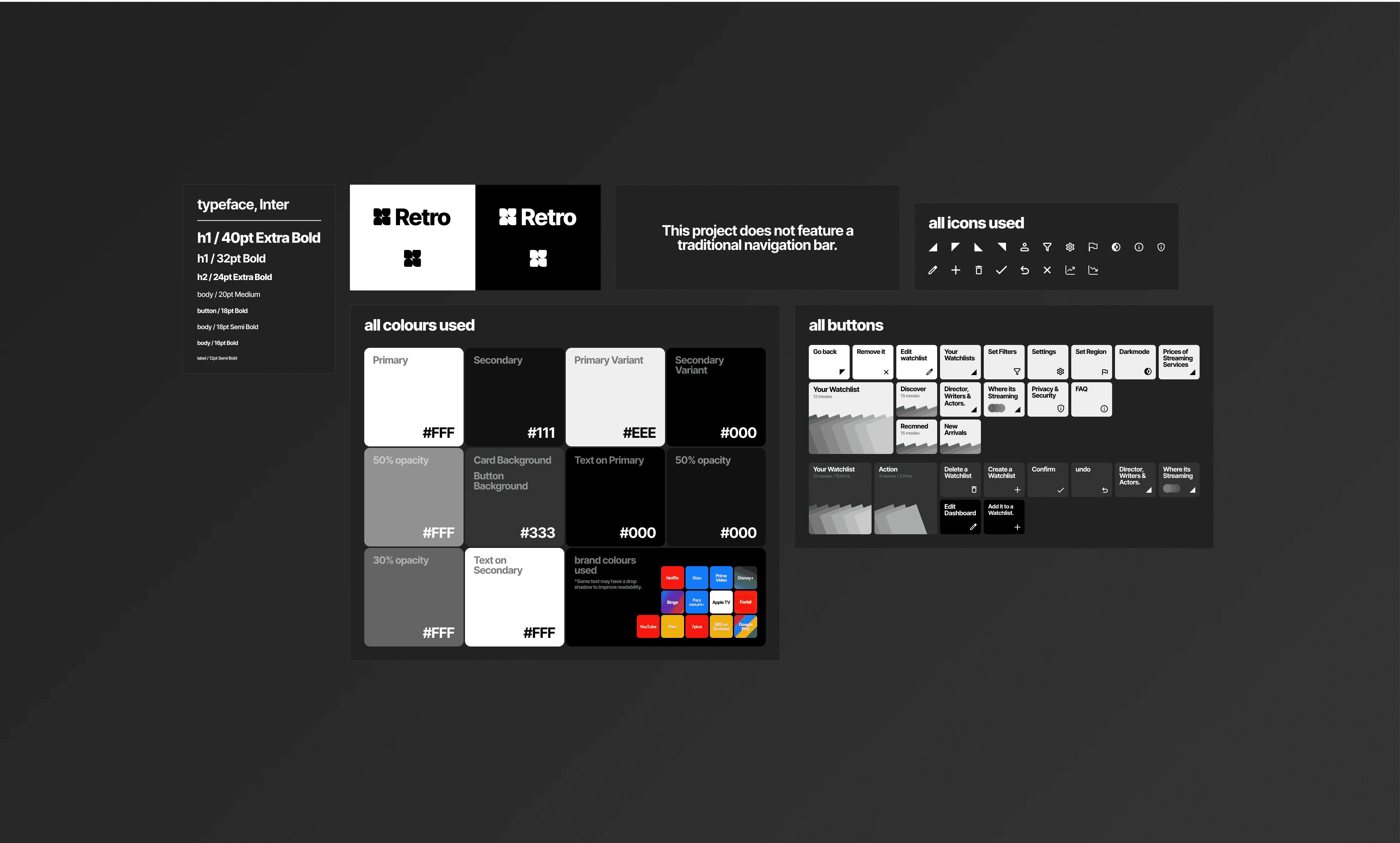
DESIGN SYSTEM
This is the (limited) design system I created for the app. Being an app design I should of looked more into the android and apple design documentation. Doing that would be ideal probably for reasons I don't even understand yet.
But I think understanding how they want you to use colour, typography etc. would make the design to develop much faster. I did look at how android likes to handle colour and I also liked it so I tried to follow that to fit my app.
At the moment I think my design systems are more documenting everything I used which I think is a partial point to them. But I think they are supposed to be used moreso beforehand then in hindsight.
OUTCOME
This was the second project I have completed outside of university, my own idea and I think the app has a solid foundation for me to build out from in the future. The research for the app was limited and somewhat off topic but I think provides good reasoning for the apps existence.
This project taught me quite a bit and has already contributed to my future projects being this very website. It was my first project utilizing the auto layout feature in Figma and how it works. Since then this website was my next project and Figmas auto layout was used extensively.
The design system for this project is also much more built out and helped to keep the app looking very clean and consistent. In the next version I will probably work more on the design system and visual design to be a bit stronger as I believe it has potential. I do think my goal and focus on the navigation has opened my mind about how navigation can work in apps.
EXTRA NOTE
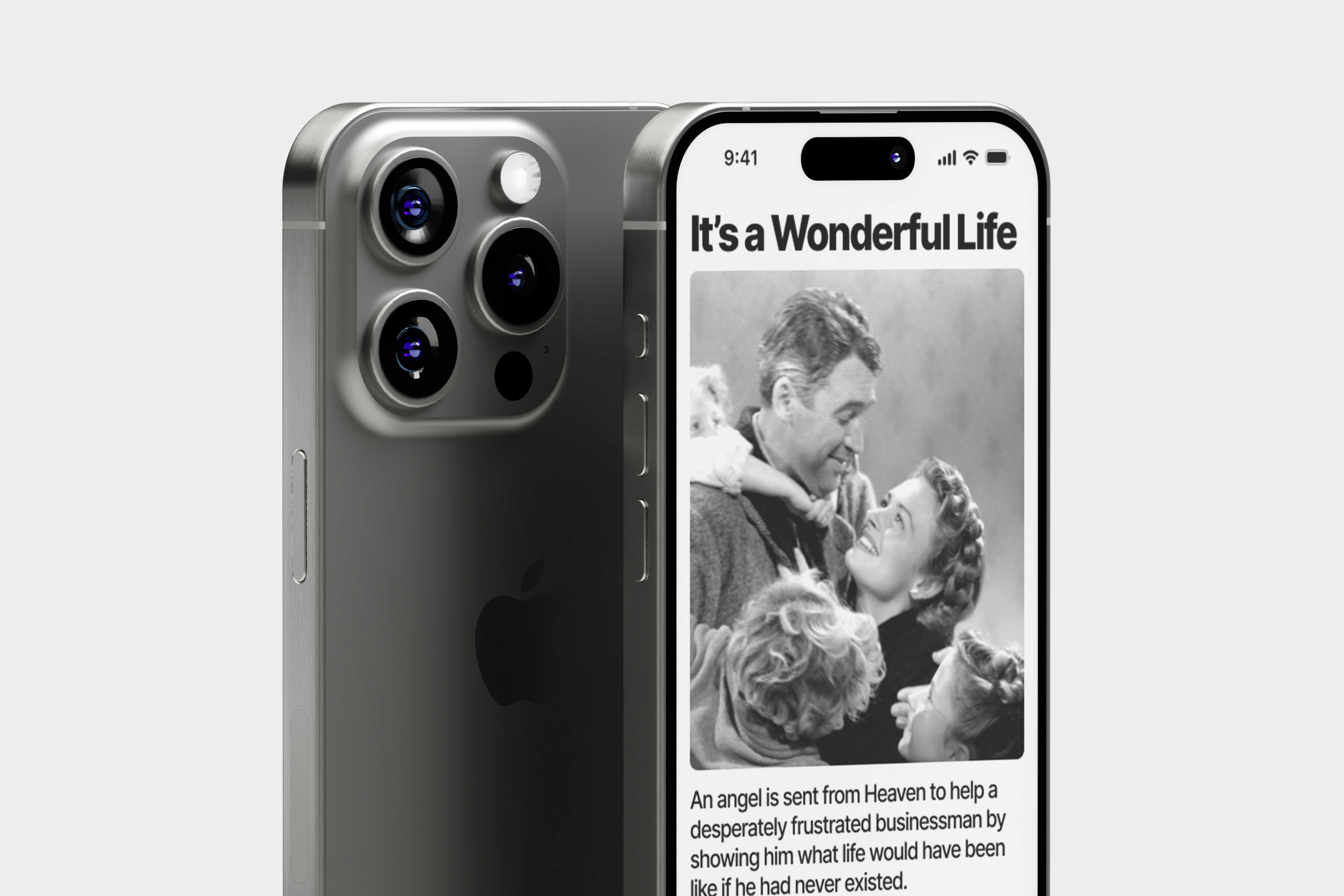
This movie I used in the mockup below is one of the reasons why I made this app. I watched and liked the movie quite a bit so I decided there should be an app dedicated to basically discovering and archiving older films you may want to watch later.
PROTOTYPING

ALL RIGHTS RESERVED