*Disclaimer
I created these poster concepts with fair use and educational purposes in mind. If you believe I have not used your work fairly please do reach out and I will take it down.
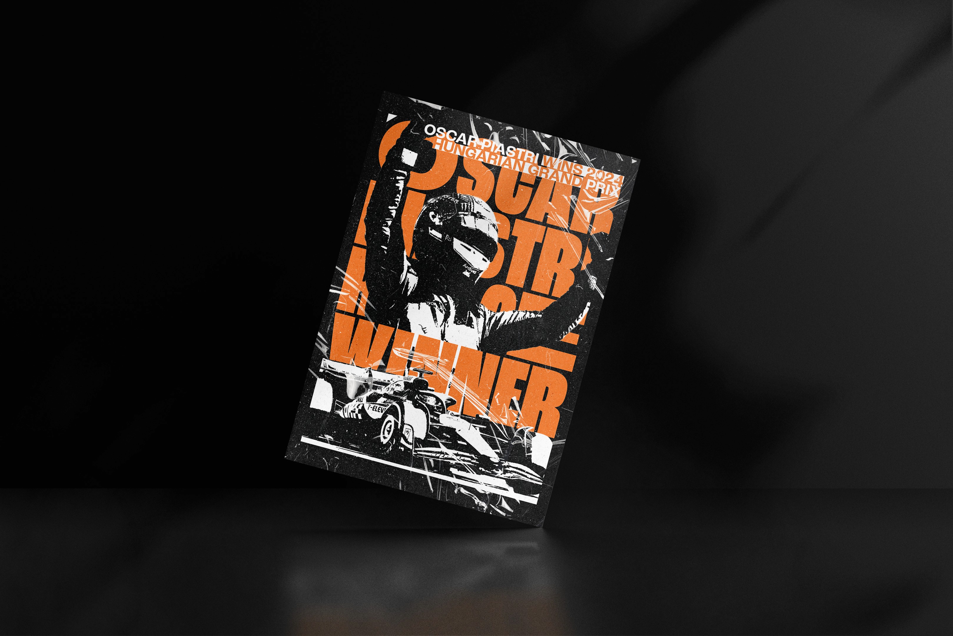
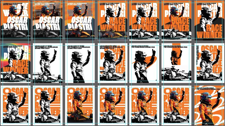
These are some poster designs created when Oscar Piastri took his maiden win at the 2024 Hungarian GP with McLaren.
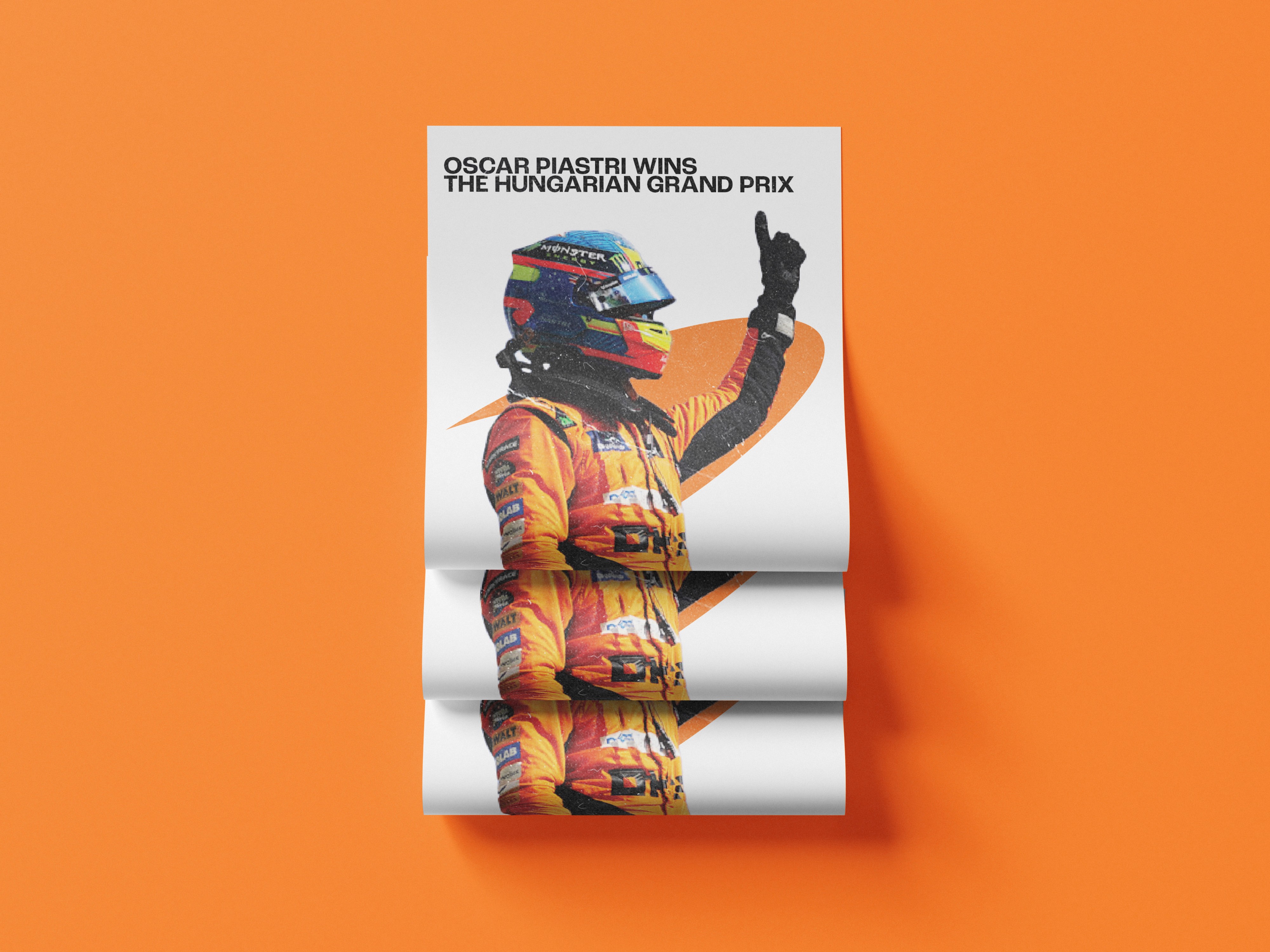
CLEAN CONCEPTS

Noisy Concepts
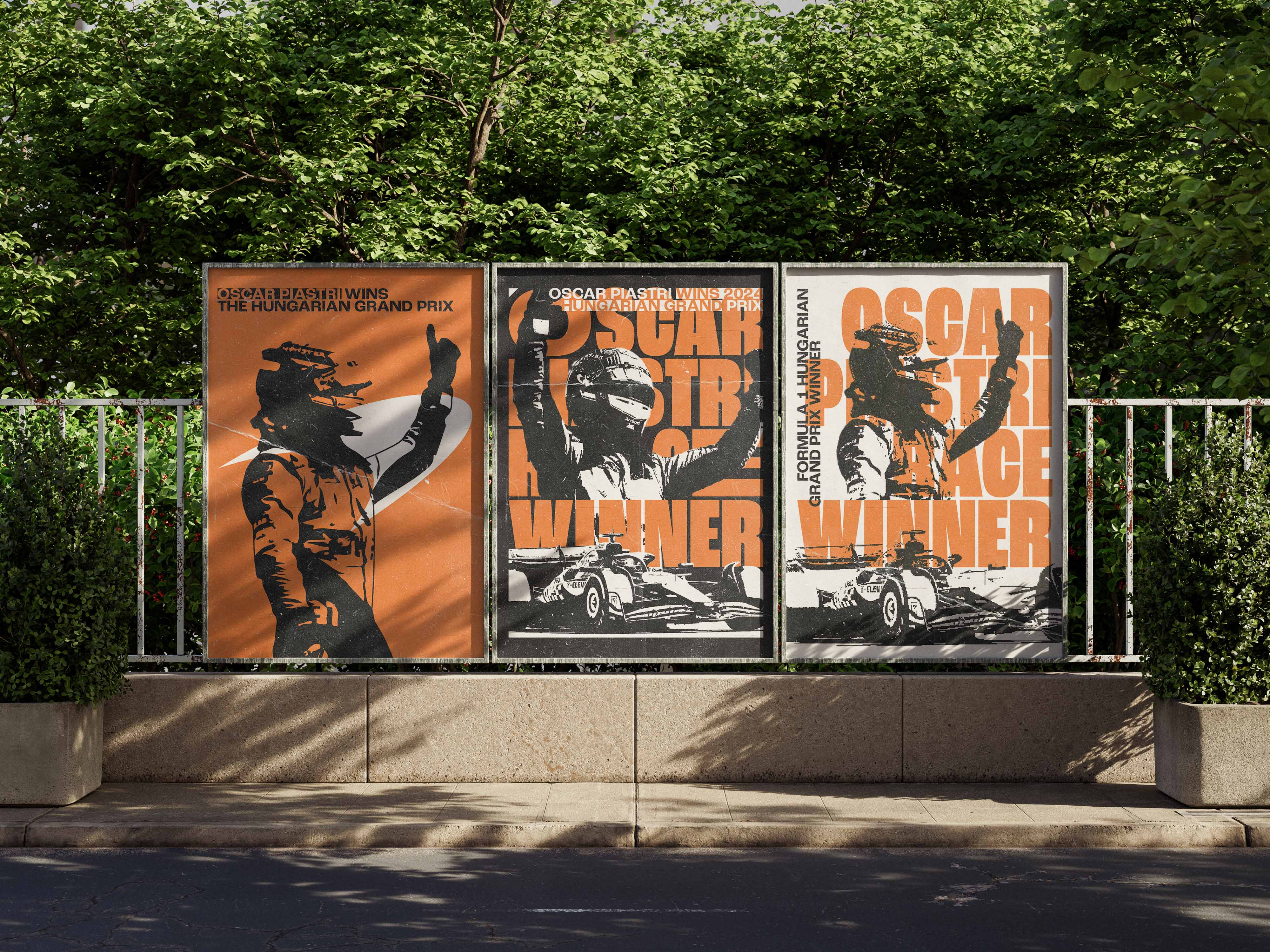
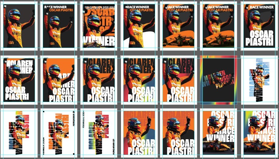
CONCEPTS & ITERATIONS
I created these posters through constant iterations, multiple concepts and exploring how typography, colour and imagery could all be changed and moved around etc.
COLOURS USED IN CONCEPTS
Specifically for the colours I mainly used an orange and black which is McLarens main colours this season. I also attempted to use the drivers helmet colours.
#000
#222
#353441
#243A76
#CA6129
#F37522
#F04A4A
#CBDB2A
#FFF
REFINED COLOURS
In the refined concepts shown at the top they consist of these colours,
#000
#CA6129
#F37522
#FFF
LAYERS
This is how I created the posters and the layers of the content all separated. I will just use one poster as an example as the others basically follow the same layout and hierarchy just more or less varying by design.

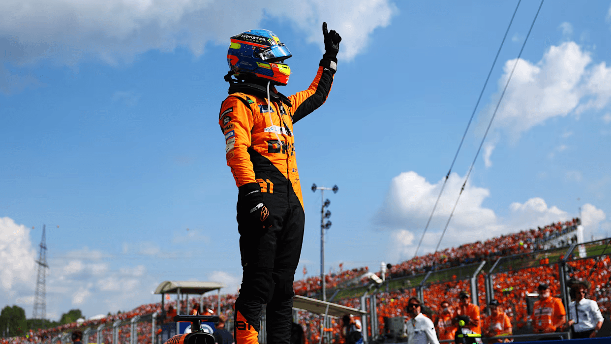
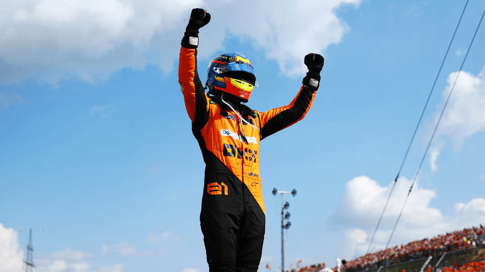
ORIGINAL IMAGERY
I did not take the photos used in the poster designs,
ORIGINAL TEXTURES
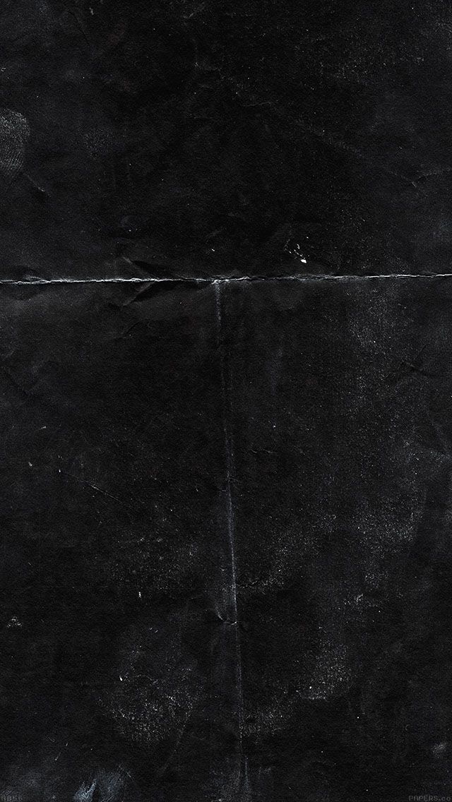
and you can find the first image, here, and the second image, here.
You can also find textures over here, Texture Labs.
ORIGINAL MOCKUPS
Most to all of my mockups are found from, Unblast. They have a lot of mockups of various different stuff and are usually free.
DIFFICULTIES
I started this quite abruptly and I think you can see that in the first concepts. Obviously I could not get quality photos and rightly so but I think adding the sort of grunge/noise pretty much cancels this problem out.
LEARNINGS
I think specifically for this I should of maybe waited a bit longer and just organised and sorted my assets out more. Finding good photos and different angles to give myself more to work with would of been much better. Definitely brainstorming the copy writing more and maybe looking at inspiration for posters that are designed around something like this.
I do think going into this project with no inspiration at all let me learn and realise a lot more after hindsight. I think going into this smaller project with no inspiration meant the overall style and visual design is much more aligned with my style of design.
Something I missed out on or didn't realise to do was to somehow someway incorporate the track in the poster. I realised this after basically finishing up and made some concepts but none worth adding. I may keep working on this type of stuff, come back to it in the future or create some new posters for past winners or any new winners in the future.
FINAL NOTES
I created this to show how I think and my process when designing a poster.
ALL RIGHTS RESERVED